

Hacked Account
July 5, 2015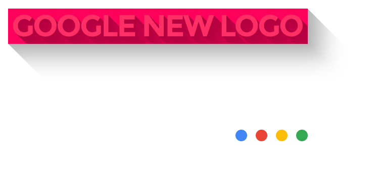
The biggest change since 1999 finally comes to Google’s new logo. A bold shift from the serif to a sans serif based design. Although Google have grown through the years, their new design feels younger, refreshed and spunky. Modern designers seem to be biased toward the sans-serif typefaces with cleaner lines and a flat design and this new logo from Google is all that.
In their unveil they said, “Google has changed a lot over the past 17 years—from the range of our products to the evolution of their look and feel.”
They have a lot more to the logo than just the letter G and the word Google. To read more about their reasons for the new design and how this plays into their ideologies, read more at their blogspot here.
Do you have anything to say about the new design? Drop your thoughts in the comments below.

